
Resources could be found HERE
The data sets are from HERE
HW3
Introduction:
The three data sets are all related to malaria.
Through a brief overview of the data sets, I found there are over 200 entities in each data set. In order to provide more efficient data visualization to users and make sure they could easily gain information about malaria in each entity, I used matplotlib and ipywidges libraries. Matplotlib could show a clear relationship between some indexes of malaria and year in every entity, while ipywidges could provide an interface to allow users to select their interested entities. I cannot show the information from all entities on one single graph, so I think giving the selection choices to users to see what entities they are interested is a good idea. To enable users to view the current entity information, they can also take into account the data of other entities. I added the curve which representes the average value in different years among all entities in table1. In table3, users could choose different year and continent to see all data of entities. Below, I will show some details of each dataset and corresponding data visulizations.
The first data set:
Overview: malaria_deaths.csv:
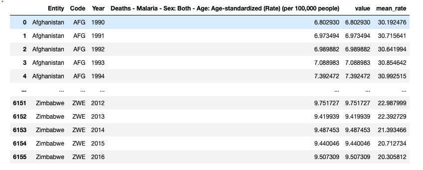
The first table contains 6 variables. The column: “value” contains the exact same values as column:”Death-Malaria-Sex: both…. people)”. It is just easier to call the values in that column by recreating a new column named “value”. Mean_rate column contains the average death rate among all entities in each year. Below is the function to achieve the visulization and interface:
Data visulization:
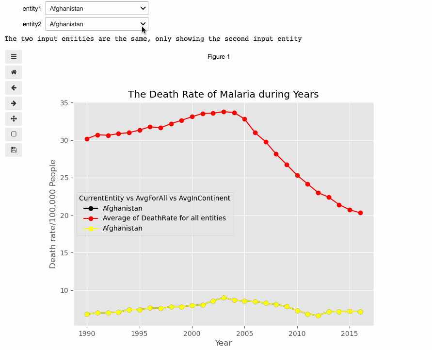
def create_plot(entity1, entity2):
    if (entity1 == entity2):
            print("The two input entities are the same, only showing the second input entity")

    with plt.style.context("ggplot"):
        fig = plt.figure(figsize=(8,6))
        fig.clear()
        plt.plot(table1[table1.Entity == entity1].Year,
                 table1[table1.Entity == entity1].value,
                 'o-',
                 color = 'black'
                   )
        plt.plot(table1[table1.Entity == entity1].Year,
                 table1[table1.Entity == entity1].year_mean_rate,
                 'o-',
                 color = 'red')
        plt.plot(table1[table1.Entity == entity2].Year,
                 table1[table1.Entity == entity2].value,
                 'o-',
                 color = 'yellow'
                   )

        plt.legend([f"{entity1}", "Average of DeathRate for all entities",\
                    f"{entity2}"], \
                   title = "CurrentEntity vs AvgForAll vs AvgInContinent")
        plt.xlabel("Year")
        plt.ylabel("Death rate/100,000 People")
        plt.title(f"The Death Rate of Malaria during Years")

widgets.interact(create_plot, entity1=sorted(set(table1.Entity)), entity2=sorted(set(table1.Entity)));
=================================
Uers could select at most two prefered entities, and there would be a line represents the average value among all entities.
Here is a brief gif picture to show how the interface works:
The second data set
Overview: malaria_deaths_age.csv
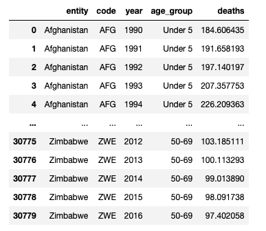
The second table contains 5 variables. In the data visulization part, I will show the death rate of all corresponding age_geoups people V.S. year in each entity. Users could select the entity they want to see the information. Below is the function to achieve the visulization and interface:
Data visulization for the second dataset:
def create_plot2(entity):

    with plt.style.context("ggplot"):
        fig = plt.figure(figsize=(10,6))
        for i in range(0, len(age)):
            plt.plot(table2[(table2["entity"] == entity) & (table2["age_group"] == age[i])].year,
                     table2[(table2["entity"] == entity) & (table2["age_group"] == age[i])].deaths,
                     'o-')
        plt.grid(ls='--')
        plt.xlabel("Year")
        plt.ylabel("Death Cases")
        plt.legend(age, title = "Age Groups", loc='best')

        plt.title(f"The Death cases v.s. Year in {entity} for different age groups")
widgets.interact(create_plot2, entity=sorted(set(table2.entity)));
=================================
Here is a gif picture to show how the interface works:
The thrid data set
Overview: malaria_inc.csv
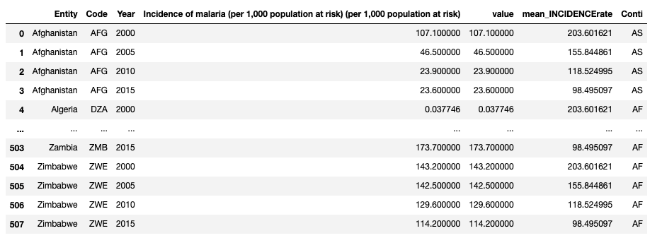
The third table contains 7 variables. The column: “value” contains the exact same values as column:”Incidence of malaria…. at risk)”. It is just easier to call the values in that column by recreating a new column named “value”. Mean_INCIDENCErate is a column contains the average death rate among all entities in each year. I also added column named Conti to store the continent name of each row. Below is the function to achieve the visulization and interface:
Data visulization for the third dataset:
#draw the plot:
import pycountry_convert as pc
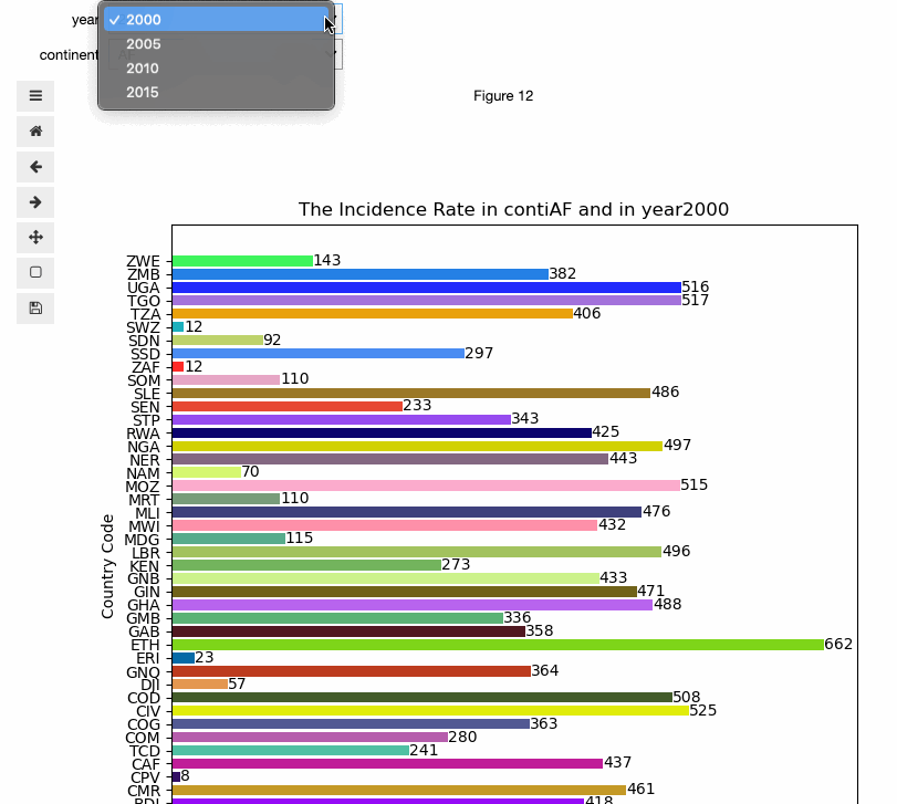
def create_plot4(year, continent):
#set pic size
fig = plt.figure(figsize=(8,8))
fig.clear()
#store the xlabel and ylabel values:
country = []
country_value = []
for index,row in table3.iterrows():
if row["Year"] == year and row["Conti"] == continent:
country.append(row["Code"])
country_value.append(row["value"])
colors = np.random.rand(len(country),3)
x = plt.barh(range(len(country_value)), country_value, tick_label=country, color = colors)
plt.ylabel("Country Code")
plt.xlabel("Incidence rate/100,000 People")
plt.title(f"The Incidence Rate in conti{continent} and in year{year}")
# add number for each bar:
for rect in x:
w = rect.get_width()
plt.text(w, rect.get_y()+rect.get_height()/2, '%d' % int(w), ha='left', va='center')
#remove world conti:
cont = list(sorted(set(table3.Conti)))
cont.remove("World")
widgets.interact(create_plot4, year=sorted(set(table3.Year)), continent=cont);
===========================
Uers could select interested year and interested continent to see the data in different countries.
Here is a brief gif picture to show how the interface works:
End ==========